Layouts
Layouts combine HTML/CSS structure and Elements, defining everything that appears within a display. They extend the base class of Elements and provide advanced methods, state, lifecycle management, and complexity.
Take a look at the layouts that are provided by our open-source framework: https://bit.cloud/unless/component-library/layout/default-popover.
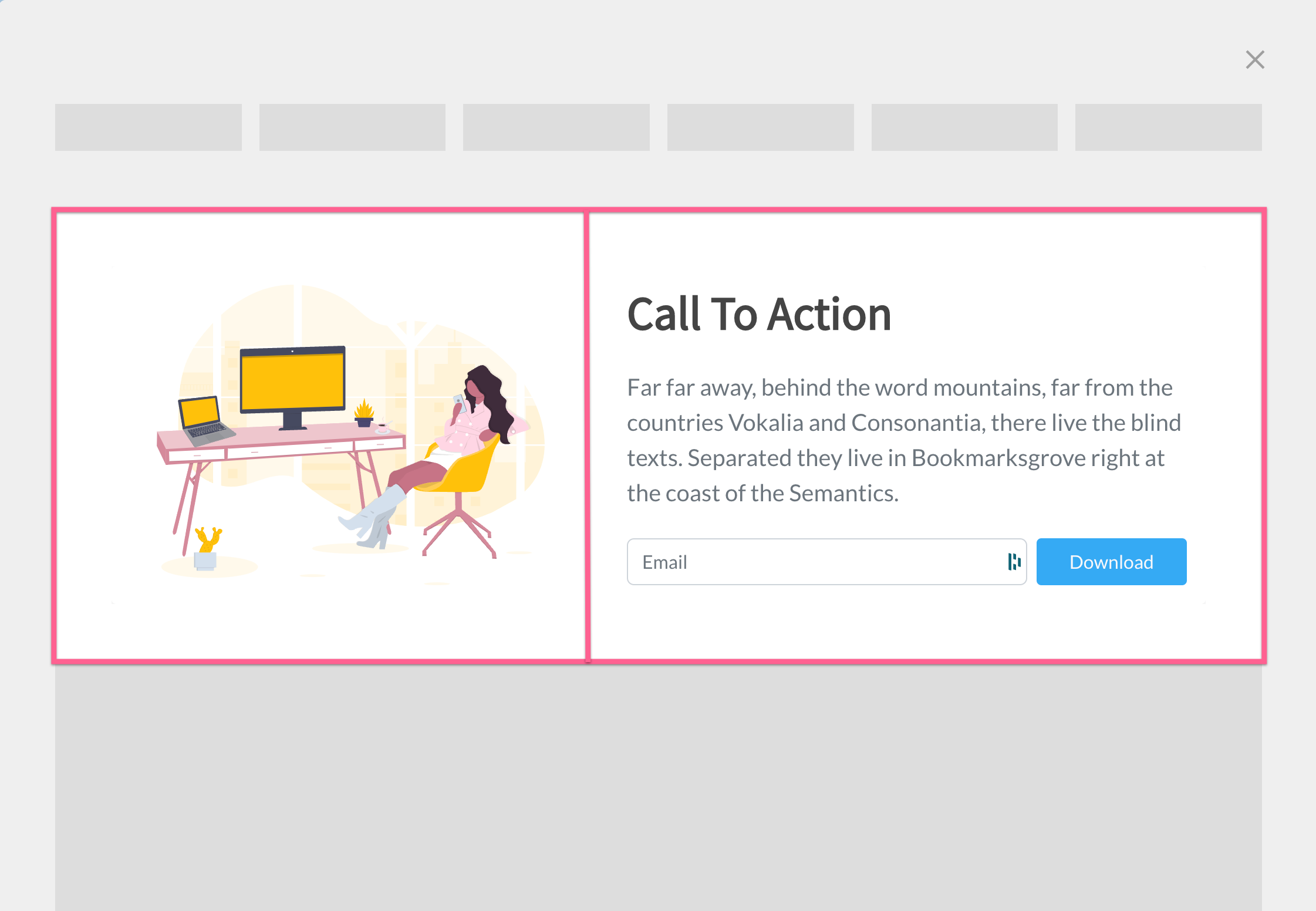
Example of a two-column layout inside a component.
Layout API
Layouts are built upon elements, but they also have their own API.
Properties
| Scope | Readonly | Name | Type | Description |
|---|---|---|---|---|
| protected | ✅ | currentIndex | number | Returns the current index of the Layout in a multistep. |
| protected | ✅ | displayType | string | This readonly property gives the Display name in which the Layout is contained. However, it is recommended not to use it as the framework architecture follows a layered approach where layers should be agnostic of each other. Please refer to the https://docs.unless.com/docs/frameworks-architecture for more details. |
| protected | ✅ | isFirstStep | boolean | Returns true if the layout is the first step of a multistep. |
| protected | ✅ | isLastStep | boolean | Returns true if the layout is the last step of a multistep. |
| protected | ✅ | isMultistep | boolean | Returns true if the layout is in a multistep. |
| protected | ✅ | isSmallLayout | boolean | Returns true if the Layout size is Sm. |
| public | ❌ | layoutSize | Size | Updates to reflect the available size of the layout, but it can be manually overridden to a fixed size. |
| protected | ✅ | maxIndex | number | Returns the index of the last step. |
| protected | ✅ | scriptName | string | The Display uses this property to create an instance of the LayoutConstructor for the current step. Its value must match the layout.type specified in the settings. |
| protected | ✅ | shadowRoot | ShadowRoot | This property refers to the ShadowRoot of the web component and can be used to access sub-elements using querySelector, among other things. |
| protected | ✅ | state | StoreStack | This is the internal state of the Layout and is not shared with the Display. To share states, use the global Stores instead. For more information, please refer to the documentation on state. |
| public | ❌ | uiSize | Size | Sets the size for sub-elements to render, independent of the Layout size. Certain Elements, like Body, require uiSize to be specified. |
Methods
| Scope | Method | Arguments | ReturnType | Description |
|---|---|---|---|---|
| protected | requestUpdate() | none | void | Manually re-render the component. This does not re-instantiate the layers, it only calls the rendering method. |
| protected | nextStep() | none | void | Goes to the next step if the layout is in a multi-step |
| protected | previousStep() | none | void | Goes to the previous step if the layout is in a multi-step |
| protected | setStep() | newIndex: number | void | Sets the step index in a multi-step |
| protected | getCTA() | flipped?: boolean | TemplateResult | Returns CTA buttons if the layout is on the last step or if in a single-step component. |
Overridable methods
1. firstUpdated
This method is called when the layout is first rendered, and will not be called again if the layout updates. Note that if the step is re-instantiated, such as a step change, firstUpdated() will be called again.
Example data fetching from API:
export class MyLayout extends Layout {
    private data: unknown

    protected override firstUpdated() {
        fetch('<https://api.example.com/>')
            .then(response => response.json())
            .then(data => this.data = data)
            .catch(console.error)
    }
}
2. disconnected
The disconnected method is called when the Layout is disconnected from the DOM. This can happen when the Layout is destroyed, for example when navigating away to another step. It is an opportunity to clean up resources that are not automatically released by the garbage collector.
Example:
export class MyLayout extends Layout {
    private handler = () => null

		protected override firstUpdated() {
				window.addEventListener('click', this.handler)
		}

    protected override disconnected() {
        window.removeEventListener('click', this.handler)
    }
}
Abstract methods
1. render
This method is responsible for rendering the layout. It should return a TemplateResult which is then rendered to the Shadow DOM. This method is called every time the layout updates.
Example:
export class MyLayout extends Layout {
    public render(): TemplateResult {
        return html`
            <div>
                <h1>Hello World!</h1>
            </div>
        `
    }
}
LayoutProps
LayoutPropsWhen implementing a Layout, it's important to keep in mind that modifying the props of the layout is not recommended, especially when re-implementing the constructor. This is because Display provides those props to the Layout, so it expects a certain schema. To work with this, you can use LayoutProps<TSettings> as shown below:
import {Layout, LayoutProps) from '@unless/component-library.layout.layout'

export class MyLayout extends Layout<MyLayoutSettings> {
		constructor(props: LayoutProps<MyLayoutSettings>) {
				super(props)
				...
		}
}
Settings
Layout settings are an essential part of any component library, as they allow users to customise the appearance and behavior of layouts to fit their specific needs. In this section, we will explain what layout settings are, how to use them, and some best practices for implementing them.
What are layout settings?
Layout settings are options that can be configured for a layout within a component library. They allow users to modify the appearance and behavior of the layout without changing its underlying code. Examples of layout settings include background colours, padding, and margins. By providing users with layout settings, you can make your layouts more flexible and adaptable to different use cases.
How to use layout settings
To use layout settings in your components, you first need to define them by creating a model that extends LayoutBaseSettings. This model should include a layout field that, at a minimum, contains a type: string with a unique identifier for the layout name.
Here's an example of how to define a layout settings model:
import {
  LayoutBaseSettings,
} from '@unless/component-library.utils.types'

export interface CustomLayoutSettingsModel extends LayoutBaseSettings {
  layout: {
    type: 'CustomLayout';
    backgroundColor: BackgroundSelectSetting;
    padding: number;
  } & LayoutBaseSettings['layout']
}
Once the layout settings model is defined, you need to create the default settings file.
Here's an example of how to create the default settings file:
/* esbuild-ignore */

import { CustomLayoutSettingsModel } from './settings-model.ts'
import { Subset } from '@unless/component-library.utils.types'
import {
  getSettings,
  deepCopy,
} from '@unless/component-library.utils.helpers'

export const customLayoutCopyWith = (
  ...settingChanges: Subset<CustomLayoutSettingsModel>[]
) => getSettings(deepCopy(settings), ...settingChanges)

const settings: CustomLayoutSettingsModel = {
  layout: {
    enabled: true,
    type: 'CustomLayout'
    padding: 10,
  },
}

export default settings
Best practices for implementing layout settings
- Extend LayoutBaseSettings: Ensure that your layout settings model extends the
LayoutBaseSettings. This provides a consistent structure for layout settings across your component library. - Provide default values: Always provide default values for your layout settings. This ensures that your layout works out of the box and allows users to customise only the settings they need.
- Use the esbuild-ignore comment: Include the
/* esbuild-ignore */comment at the beginning of your settings file to optimise the build process and ensure that default settings are not included in the generated components. - Implement the CopyWith method: Implement a
[layoutName]CopyWith()method in your settings file to allow for easy modification of specific settings without having to update the entire settings object manually. This method should accept aSubsetvalue of the settings model and return a new settings object with updated values. - Document your settings: Thoroughly document each setting to ensure that users understand its purpose and possible values. This will help users effectively use and customise your layouts.
By following these best practices, you can create flexible, customisable layouts that are easy for users to work with and adapt to their specific needs.
Advanced: mixin pattern
Sometimes, two layouts can be almost identical except for one element. In such cases, the simplest solution is to create two layouts that share most of the same code and only differ in the Element that needs to be changed. However, this approach has a few issues:
- It creates code duplication,
- It's difficult to scale and maintain since you need to update both
Layoutsevery time you make a change to one of them, - It can create name collisions or confusion for end-users when many
Layoutshave similar names.
The more complex, but better solution in this situation is to use the mixin pattern. Here’s an example of how one can implement such a pattern:
1. Create the element components
To begin, let's create the Elements that will be passed into the mixin. For the sake of simplicity, we'll only create two Elements in this example, but feel free to create more as needed.
// Element A
interface ElementAProps extends ElementSettingsProps<ElementASettings> {}

export type ElementAConstructor = {
		new (props: ElementAProps): ElementA
}

export class ElementA extends Element<ElementASettings> {
	static defaultSettings = () => deepCopy(settings) as any
	static type = 'ElementA'
	...
}
// Element B
interface ElementBProps extends ElementSettingsProps<ElementBSettings> {}

export type ElementBConstructor = {
		new (props: ElementBProps): ElementB
}

export class ElementB extends Element<ElementBSettings> {
	static defaultSettings = () => deepCopy(settings) as any
	static type = 'ElementB'
	...
}
For convenience, we added two types, ElementAConstructor and ElementBConstructor. These types will be used to infer the type of settings in the mixin Layout.
NB
Please keep in mind that, when using the mixin function, we add a static function to obtain the appropriate
elementsettings at the right time, as well as atypethat will complete thelayouttype.
NBB
Also note that if
ElementAPropsandElementBPropsdon't have the same schema, except forsettings, it will have to be manually handled in the mixin.
2. Define the settings model for mixin layout
Next, we need to develop the model for the Layout settings. It's important to create a settings property with a consistent name, regardless of the passed mixin to be used to access the passed-in Element settings. In this example, we'll use 'content' as the common key.
export type ElTypeMap = {
		ElementASettings: ElementASettings;
		ElementBSettings: ElementBSettings;
}

export type ElementSettings<T extends keyof ElTypeMap> = ElTypeMap[T]

export interface
	MyMixinLayoutSettings<T extends keyof ElTypeMap> extends LayoutBaseSettings {
		layout: LayoutOtherSettings & LayoutBaseSettings['layout']
		content: ElementSettings<T>
}
This code defines a generic type alias and an interface for creating a mixin layout settings object that is flexible and scalable for different element settings. Here's an explanation of each part:
ElTypeMap: This type maps the string keys to their respective element settings types. In this case, it maps 'ElementASettings' toElementASettingstype and 'ElementBSettings' toElementBSettingstype. This mapping allows for easy extension by adding more element settings types as needed.ElementSettings: This generic type alias takes a type parameterT, which must extend one of the keys in theElTypeMap. The type alias then returns the corresponding settings type from theElTypeMapusing the keyT. This enables you to dynamically define the element settings type based on the provided key.MyMixinLayoutSettings: This generic interface extends theLayoutBaseSettingsinterface and takes a type parameterT, which must extend one of the keys in theElTypeMap. The interface includes the following properties:layout: A combination of theLayoutOtherSettingstype and thelayoutproperty type fromLayoutBaseSettings.content: This property uses theElementSettingstype alias with the type parameterT, resulting in the corresponding settings type from theElTypeMap.
The MyMixinLayoutSettings interface allows you to create a mixin layout settings object that can accommodate different element settings types by specifying the appropriate key from the ElTypeMap. As new element settings types are added to the ElTypeMap, the MyMixinLayoutSettings interface can scale accordingly without requiring any additional modifications.
3. Define shared settings for the mixin layout
Now that we have a model, we can create a JavaScript object that holds all the shared settings for the mixin. In this context, it will be quite straightforward, since the only (partially) shared setting will be layout.
/* esbuild-ignore */

import {MyMixinLayoutSetting} from './settings-model.ts'
import {
		baseFontSetting,
		fontLoaderSetting
} from '@unless/component-library.layout.layout'

const SettingsShared: Omit<MyMixinLayoutSettings<any>, 'content'> = {
		layout: {
				enabled: true,
				type: 'MyMixinLayout',
				baseFont: baseFontSetting,
				fontLoader: fontLoaderSetting,
		}
}
- First, we should omit the property where the mixin
Elementsetting will be stored, since it is not a shared setting due to the differing type and shape. We need to pass a generic to the mixin settings interface, however, in this case we can simply pass it asanysince we are not concerned with the shape of the mixin for shared settings. - To comply with the
layoutschema, we must provide a type. This can be the name of the layout, but we will eventually override it, so the specific name is not important.
4. Define settings for specific mixin layouts
To create mixin-specific settings that can be easily scaled, a recommended approach is to write a function that dynamically returns these settings. In this context, we can utilise the helper function getSettings to achieve this. Here's how to implement this approach:
function settings<T extends keyof ElTypeMap>({
		type,
		content
}: {type: string, content: ElementType<T>}) {
		return
				getSettings(
						SettingsShared,
						{
								layout: {type},
								content,
						},
				) as MyMixinLayoutSettings<T>
}
The settings function is a generic function that takes a type parameter T, which must extend keyof ElTypeMap. The function accepts an object with two properties: type and content. The type is a string that represents the layout type, while content is of type ElementType<T>.
The function uses the getSettings helper function to merge the shared settings (SettingsShared) with the provided type and content. It then casts the result as MyMixinLayoutSettings<T>, which represents the combined settings for the mixin layout.
5. Implement the mixin layout
To complete the process, we can now proceed with implementing the mixin layout, which entails defining a few helper types and the mixin function. The following steps outline how to do so using our current example:
interface MyMixinLayoutElementMap extends IElementMap {
	ElementA: {Constructor: ElementAConstructor, Settings: ElementASettings}
	ElementB: {Constructor: ElementBConstructor, Settings: ElementBSettings}
}

export const MyMixinLayout: MixinLayout<MyMixinLayoutElementMap> =
	(contentConstructor) => {
		validateMixin(contentConstructor, ['ElementA','ElementB'])

		const _MyMixinLayout =
			class extends Layout<MixinLayoutSettings<MyMixinLayoutElementMap>> {
				static defaultSettings = () => {
					switch (contentConstructor.type) {
					case 'ElementA':
						return settings<MyMixinLayoutElementMap['ElementA']['Settings']>({
							type: 'MyMixinLayoutElementA',
							content: ElementA.defaultSettings(),
						})
					case 'ElementB':
						return settings<MyMixinLayoutElementMap['ElementA']['Settings']>({
							type: 'MyMixinLayoutElementB',
							content: ElementB.defaultSettings(),
						})
					default:
						throw new Error('Invalid constructor!')
					}
				}

				static from =
					(props: LayoutProps<MixinLayoutSettings<MyMixinLayoutElementMap>>)
						=> new _MyMixinLayout(props).render()

				static type = 'MyMixinLayout' + contentConstructor.type

				public render() {
					...
				}
			}

		return Object.assign(_MyMixinLayout as Omit<typeof MyMixinLayout, never>)
}
Explanation of the code:
- Define
MyMixinLayoutElementMapinterface: This interface extendsIElementMapand maps the element types to their respective constructors and settings. This helps create a strongly-typed layout system with proper type checking.
interface MyMixinLayoutElementMap extends IElementMap {
	ElementA: {Constructor: ElementAConstructor, Settings: ElementASettings}
	ElementB: {Constructor: ElementBConstructor, Settings: ElementBSettings}
}
- Create
MyMixinLayoutfunction: This function takes acontentConstructorargument and returns a layout class that can handle the provided content type.
export const MyMixinLayout: MixinLayout<MyMixinLayoutElementMap> =
	(contentConstructor) => {
		...
	}
- Validate content constructor: The
validateMixinfunction checks whether thecontentConstructoris one of the supported types, i.e.,ElementAorElementB. If it isn't, the function will throw an error.
validateMixin(contentConstructor, ['ElementA','ElementB'])
- Define
_MyMixinLayoutclass: This class extendsLayoutand takes care of rendering the content based on thecontentConstructorprovided. The class also defines static methods for default settings and creating layout instances.
const _MyMixinLayout =
	class extends Layout<MixinLayoutSettings<MyMixinLayoutElementMap>> {
		...
	}
- Define
defaultSettingsmethod: This static method returns the default settings for the layout based on the content constructor type. It uses a switch statement to handle different types of constructors.
static defaultSettings = () => {
	switch (contentConstructor.type) {
	case 'ElementA':
		...
	case 'ElementB':
		...
	default:
		throw new Error('Invalid constructor!')
	}
}
- Define
frommethod: This static method creates a new instance of the_MyMixinLayoutclass and renders the layout based on the provided props.
static from =
	(props: LayoutProps<MixinLayoutSettings<MyMixinLayoutElementMap>>)
		=> new _MyMixinLayout(props).render()
- Define
typeproperty: This static property holds a unique identifier for the layout, which is a combination of the base layout type and the content constructor type.
static type = 'MyMixinLayout' + contentConstructor.type
- Implement the
rendermethod: This method takes care of rendering the layout with the provided content. The actual implementation will depend on the layout's structure and styling.
public render() {
	...
}
- Return the layout class: Finally, the
MyMixinLayoutfunction returns the_MyMixinLayoutclass with its methods and properties assigned.
return Object.assign(_MyMixinLayout as Omit<typeof MyMixinLayout, never>)
With this mixin layout implementation, you can easily create and manage complex layouts by combining various elements in a modular and maintainable way.
Summary
In summary, this documentation has provided a comprehensive guide on how to create and use mixin layouts effectively. We discussed the benefits of using the mixin pattern, which include reducing code duplication, making code more maintainable, and avoiding name collisions. We then walked through the step-by-step process of implementing mixin layouts, which involved:
- Creating Elements for Mixin Layouts,
- Developing the Settings Model,
- Defining Shared Settings,
- Defining Mixin Specific Settings,
- Implementing the Mixin Layout.
By following these steps, developers can build modular and maintainable layouts that can be easily extended and customised to suit various requirements. The mixin pattern enables developers to create complex layouts by combining various elements in a scalable and modular manner.
As a next step, developers can apply these concepts and techniques to their own projects, building reusable mixin layouts that cater to their specific use cases. Additionally, developers can explore more advanced use cases, such as creating mixin layouts with multiple elements or incorporating dynamic behavior into mixin layouts.
By incorporating mixin layouts into your development workflow, you will be able to create more flexible, maintainable, and scalable layout designs that can adapt to various requirements and use cases.
Updated over 1 year ago