Components
Components are the building blocks of the Unless Component Framework. They are composed of displays, layouts, and elements, which come together to form a fully functional and reusable UI component. Components can be easily integrated into existing websites and are highly customisable through the use of settings and variants. You'll find all our components in our bit repository here: https://bit.cloud/unless/component-library/component/bar/one-row.
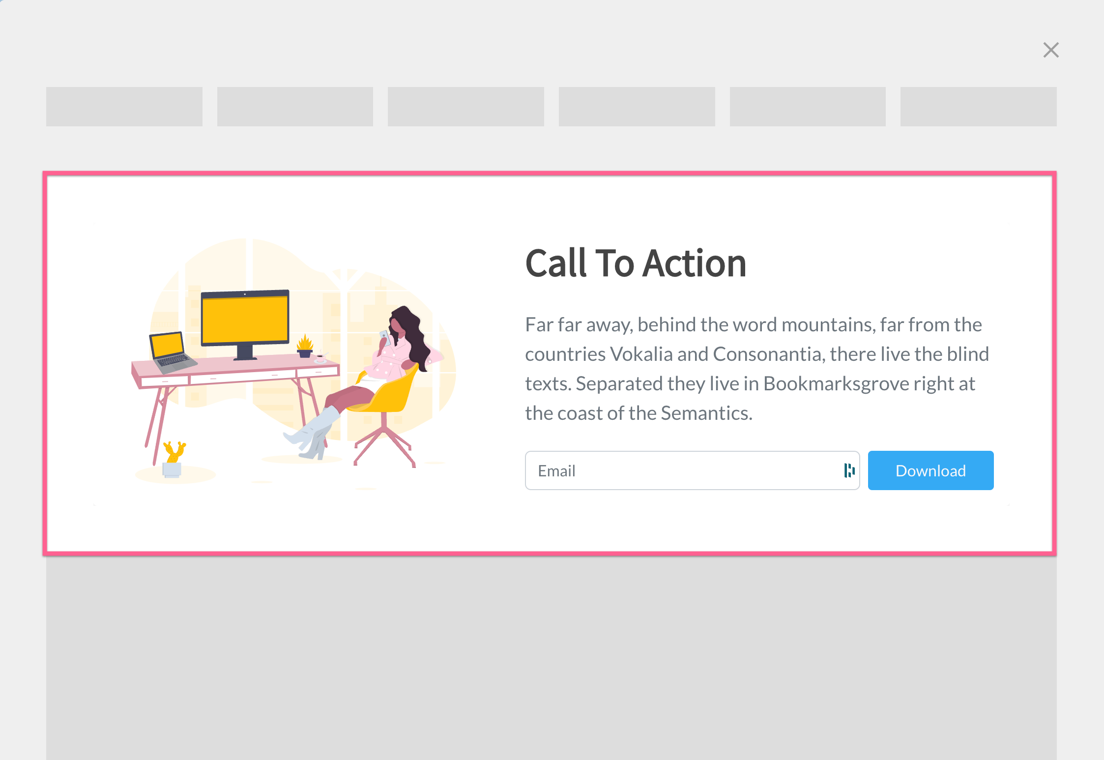
Example of an inline component containing a two column layout.
Creating a component
To create a component, developers use a function called Compose. This function takes in the component's displays, layouts, and elements, and returns a fully compiled and functional component. Here's a basic example of creating a component:
import {Inline} from '@unless/component-library.display.inline'
import {TwoRowLogos} from '@unless/component-library.layout.two-row-logos'
import {Compose} from '@unless/component-library.utils.compose'
import {UnlessComponent} from '@unless/component-library.utils.utils'

@UnlessComponent
export class InlineTwoRowLogos extends Compose({
  display: Inline,
  layouts: [TwoRowLogos],
  scriptName: 'InlineTwoRowLogos',
}) {}
Compose function
The Compose function is responsible for combining the provided displays, layouts, and elements into a single, fully functional component. It takes an object with the following properties:
display: The display for the component, which defines how the component will render on a website.layouts: An array of layouts for the component, which define the structure and behavior of the component.scriptName: A string that represents the name of the component. This should be unique to avoid conflicts with other components.
UnlessComponent decorator
The @UnlessComponent decorator is used to mark the component class as an Unless Component. This enables the framework to properly identify and manage the component during compilation and runtime.
Attaching a component
After creating a component, it needs to be attached to the framework. The attach function is used for this purpose:
import {attach} from '@unless/component-library.utils.helpers'
import {InlineTwoRowLogos} from './inline-two-row-logos'
import {Instance} from '@unless/component-library.utils.types'
import {Display} from '@unless/component-library.display.display'
import {InlineSettings} from '@unless/component-library.display.inline'

attach('InlineTwoRowLogos', InlineTwoRowLogos.type, (instance: Instance): Display => {
  return new InlineTwoRowLogos(instance.content as InlineSettings, instance.settings)
})
The attach function takes three arguments:
scriptName: A string that represents the name of the component. This should match thescriptNameused when creating the component with theComposefunction.type: The type of the component, which is typically obtained from the component class using thetypeproperty.callback: A callback function that returns an instance of the component. This function takes anInstanceobject as its argument, which contains the content and settings of the component.
Component variants
Components use variants to allow developers to configure various aspects of the component, such as colours, fonts, and other design elements. Variants are similar to settings, but they are specific to each variant of the component. Here's an example of defining a variant for a component:
import {Variant} from '@unless/component-library.display.display'
import {InlineSettings} from '@unless/component-library.display.inline'
import {TwoRowLogosSettings} from '@unless/component-library.layout.two-row-logos'
import {compilerExport} from '@unless/component-library.utils.helpers'
import {InlineTwoRowLogos} from '../inline-two-row-logos'
import base from './base'

const announcement: Variant<InlineSettings> = (settings) => {
  const baseSettings = base(settings)

	const layout = baseSettings.instance.content.stepper.steps[0] as TwoRowLogosSettings

	layout.header.title.value = 'We integrate with:'

	return baseSettings
}

export default announcement

compilerExport(InlineTwoRowLogos.defaultSettings, announcement)
This example defines a variant called announcement for the InlineTwoRowLogos component. The announcement variant modifies the base settings of the component by changing the layout.header.title.value property to 'We integrate with:'.
To apply the announcement function to the default settings of the InlineTwoRowLogos component, the compilerExport function is used in this example. The modified settings are then made available for further usage in the Node.js environment. This approach ensures that the variant configurations are correctly applied to the component, making it easy to create and manage different component variants.
When using a component with a specific variant, the component's behavior or appearance will change according to the variant's configuration.
By leveraging variants, developers can create highly flexible components that can be easily customised to fit different use cases or design requirements. This approach ensures that components can be tailored to specific scenarios while maintaining a consistent and maintainable codebase.
Folder structure
The folder structure for components in the Unless Component Framework is designed to be organised and consistent, making it easier for developers to understand and maintain the codebase. Here's the folder structure for a component called InlineTwoRowLogos:
./inline/
  └── two-row-logos/
      ├── inline-two-row-logos.ts       {1}
      ├── index.ts                      {2}
      ├── variants/                     {3}
      │   ├── base.ts
      │   ├── announcement.ts
      │   └── ... (other variants)
      └── inline-two-row-logos.composition.ts {4}
Folder structure explanation
inline-two-row-logos.ts{1}: This file contains the main component definition, created using theComposefunction and the@UnlessComponentdecorator.index.ts{2}: This file contains theattachfunction that registers the component with the Unless Component Framework.variants/{3}: This folder contains the variant definition files for the component. It must minimally contain thebase.tsfile, which defines the base variant settings. The compiler will compile every variant in this folder.inline-two-row-logos.composition.ts{4}: This file is used for local development previewing. It defines aLitElementcustom element that uses the component and its variants for testing and demonstration purposes.
Composition file
The inline-two-row-logos.composition.ts file allows developers to preview the component and its variants during local development. It contains a custom LitElement class that renders the component with the specified variant settings. Here's an example of the file's content:
import {LitElement} from 'lit'
import {customElement, property} from 'lit/decorators.js'
import single from './variants/single'
import {InlineTwoRowLogos} from './inline-two-row-logos'
import base from './variants/base'
import announcement from './variants/announcement'
import testimonial from './variants/testimonial'
import testimonial2 from './variants/testimonial2'

@customElement('inline-two-row-logos-composition')
class InlineTwoRowLogosComposition extends LitElement {
  @property() settingsName

  public override connectedCallback() {
    super.connectedCallback()

    let settings

    // Determine the appropriate settings based on the settingsName property
    // ...

    settings.instance.content.inline.selector.value = `[settingsName=${this.settingsName}]`

    document.body.appendChild(new InlineTwoRowLogos(settings.instance.content, settings.instance.settings))
  }
}

export const Default = `<inline-two-row-logos-composition settingsName="base"></inline-two-row-logos-composition>`
export const Single = `<inline-two-row-logos-composition settingsName="single"></inline-two-row-logos-composition>`
export const Announcement = `<inline-two-row-logos-composition settingsName="announcement"></inline-two-row-logos-composition>`
export const Testimonial = `<inline-two-row-logos-composition settingsName="testimonial"></inline-two-row-logos-composition>`
export const TestimonialOneRow = `<inline-two-row-logos-composition settingsName="testimonial2"></inline-two-row-logos-composition>`
This file exports a set of strings containing the HTML code to render the component with different variant settings. The custom element inline-two-row-logos-composition is responsible for appending the component to the document body with the correct settings based on the settingsName property.
By following this strict folder structure, developers can maintain a clean and organised codebase, making it easier to work with components and their variants across different projects
Updated over 1 year ago