Core concepts
Component architecture
The Unless Component Framework is a Web Components-based framework for creating flexible, reusable, and customisable web components. The framework's component architecture consists of three key concepts: displays, layouts, and elements.
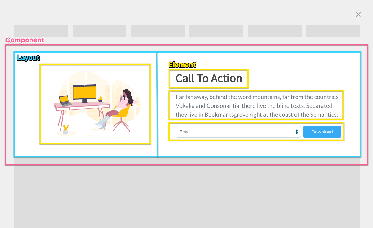
Components consist of a Layout containing multiple Elements. In this example, an Inline Display is used.
Displays
Each component in the framework has a single display, which defines how the component will render on a website.
Standard displays that are offered by Unless are Inline, Bar, Overlay, Sidebox, and Popover. Each of them renders differently into a website page. Read more about displays.
Layouts
Additionally, components have one or more layouts, which define the structure of a component, including its HTML and CSS. Layouts are an extension of the Element class, which is a very abstract and generalist class that can be extended into more complex elements. A layout typically contains multiple Elements.
If a component has only one layout, it will be a single-step component, but if it has multiple layouts, it will act as a multi-step component. Multi-step components can guide users through a series of tasks or interactions by presenting each step as a separate layout.
Layouts can contain reusable elements that can be used across multiple different layouts. This allows developers to create complex components by combining and reusing smaller, more manageable elements. When creating a new layout for a component, developers will use and create new elements as needed. Read more about layouts.
Settings
Layouts and displays in the framework have settings, which are comprised of two parts: the model and the actual JavaScript object. Settings allow developers to configure various aspects of the layout or display, such as colours, fonts, inner content and other design elements.
Elements in the framework may also have settings, but this is optional. Settings can be used to provide additional configuration options for elements, such as custom behaviours or functionality. Read more about settings.
Variants
Components in the framework use variants instead of settings. Variants are similar to settings in that they allow developers to configure various aspects of the component, but they are specific to each variant of the component. For example, a modal component might have variants for different sizes or styles.
By using settings and variants, developers can create components that are highly flexible and customisable, and can be easily integrated into existing websites. The framework takes advantage of Web Components technology, including the use of the shadow DOM, to ensure that components are fully encapsulated and do not interfere with other elements on a website. Read more about variants.
Layering system
The framework's component architecture is designed to be highly layered, with each layer building upon the one below it to create complex and powerful components.
Displays
The base layer of the architecture is the display, which defines how a component will render on a website. Displays provide the foundation for components and are responsible for rendering the overall structure of a component on the page.
Layouts
Layouts are the next layer in the architecture, and they build upon the display layer to define the structure of a component in more detail. Layouts are essentially collections of elements that work together to create a specific UI functionality or behavior. Layouts can be highly specialised and tailored to specific use cases and can be combined and reused to create more complex components.
Elements
Elements are the topmost layer in the architecture, and they are essentially specialised custom HTML tags that can be defined and used within layouts to create complex UI components. Elements are highly reusable and customisable, and can be combined and reused within layouts to create powerful and flexible components. Read more about elements.
Components
Components are the combination of all layers put together. They are essentially a fully functional, reusable UI component that can be easily integrated into an existing website. To create a component, developers use a function called "Compose", which takes in the component's displays, layouts, and elements, and returns a fully compiled and functional component.
Components are highly customisable and can be configured using variants, which allow developers to change various aspects of the component, such as colours, fonts, and other design elements. By using variants, developers can create highly specialised and tailored components that are perfectly suited to their needs. Read more about components.
Layers are agnostic
One of the key features of the framework's layered architecture is that layers are typically agnostic of each other. For example, a layout called "TwoColumns" should not (and typically does not) know that it is inside an "Overlay" display. This is because "TwoColumns" could also be reused with a different display and should still be able to render.
This agnostic approach to layering allows developers to create highly flexible and modular components that can be easily reused and combined in new and innovative ways. When creating any layer, whether it's a display, layout, or element, developers should strive to create it in a way that is agnostic of other layers, so that it can be easily combined with other layers to create more complex components.
By using a layered architecture with agnostic layers, the Unless Component Framework provides developers with a powerful tool for creating complex and flexible web components. The framework's focus on modularity and reusability makes it an ideal choice for developers who need to create custom web components that can be easily integrated into existing websites.
Updated over 1 year ago